
- Client
- Food
- Service
- Brand identity - Signage and graphic environments - Digital design
- Year
- 2024
- Duration
- 12 months
Context
Guapaletas was born at a moment when natural, artisanal products are trending and a big differentiator in the market. They picked us to rebuild a brand that shows up to satisfy everyone who wants to enjoy high-quality ice cream, made with the best natural ingredients, prepared from scratch.
Brand Challenge
Land an image that’s in visual and verbal sync with Guapaletas’ attributes: artisanal, natural and packed with flavor.
What we did
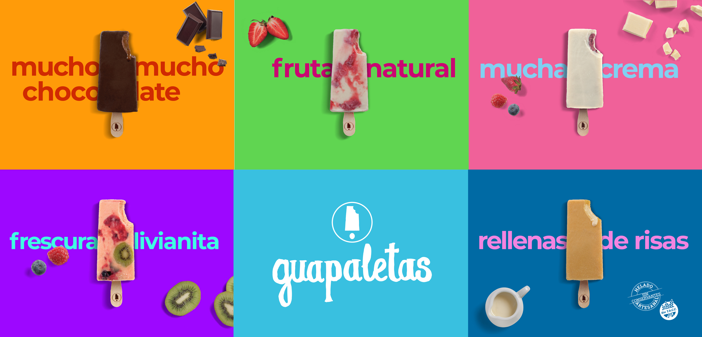
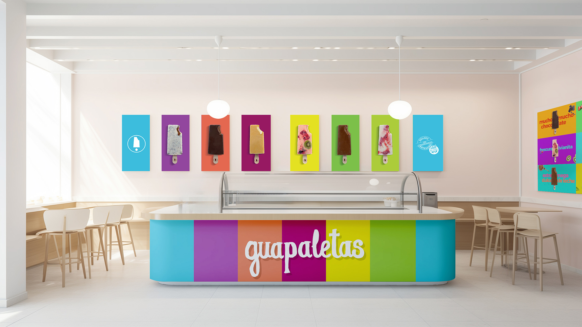
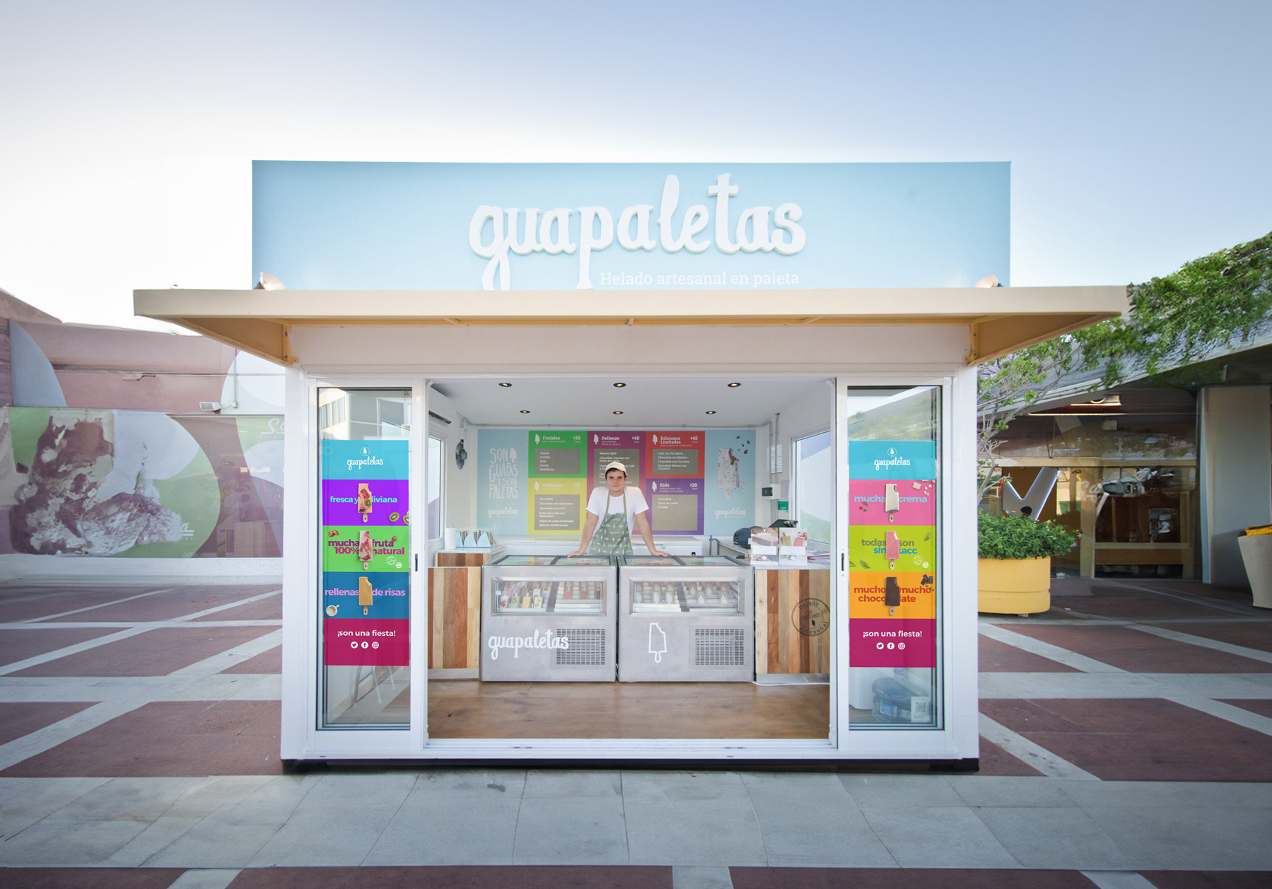
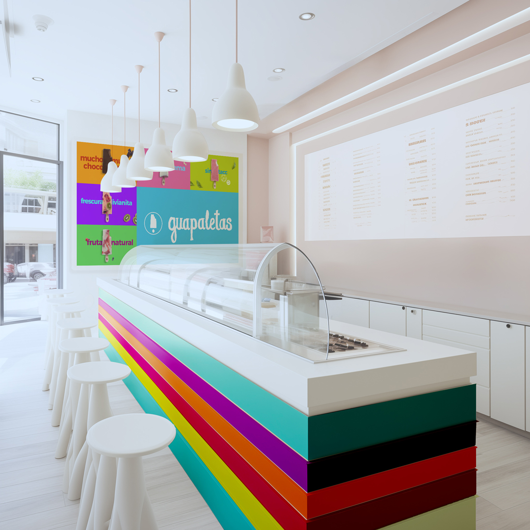
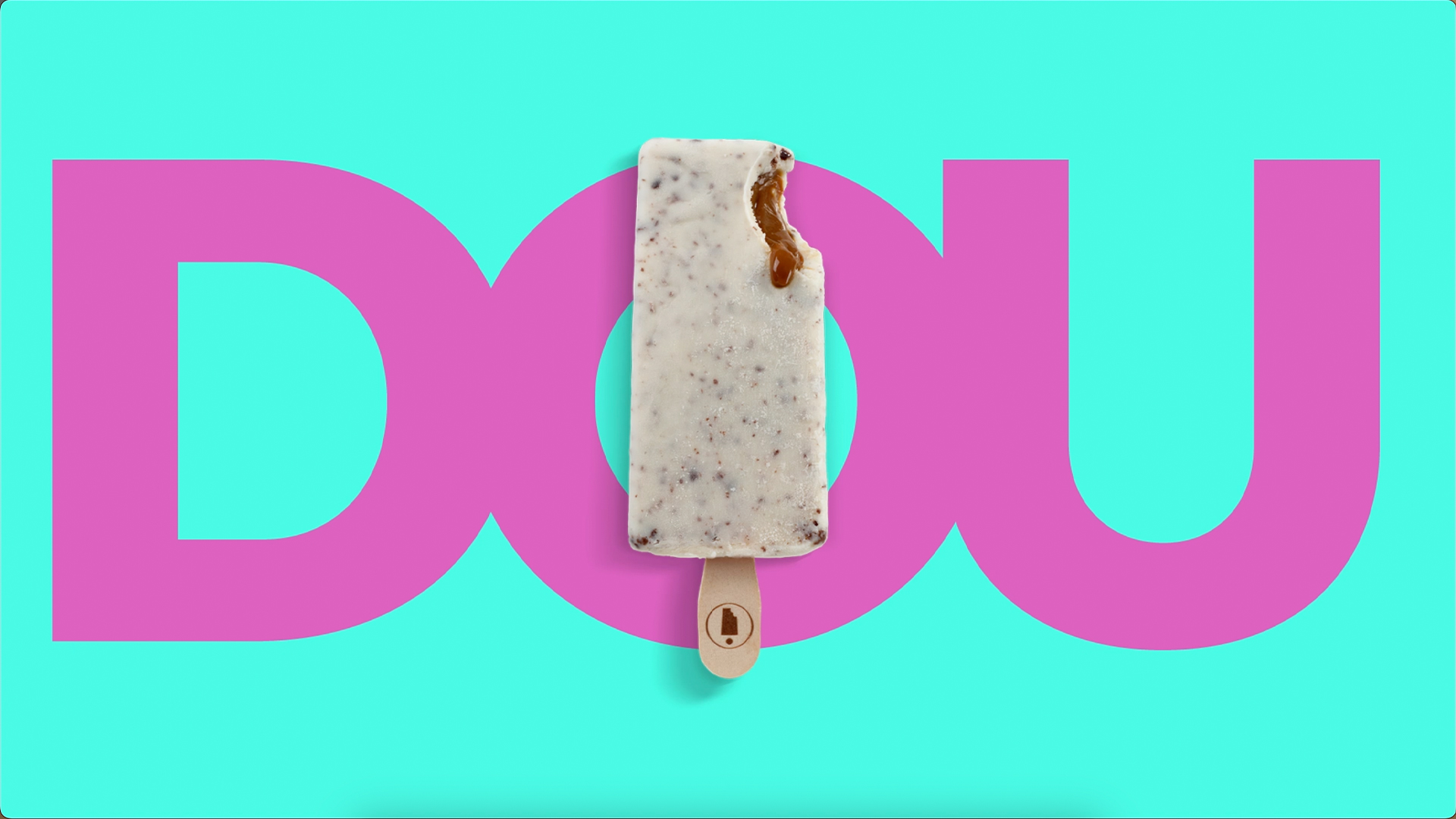
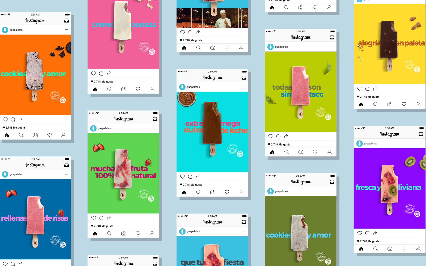
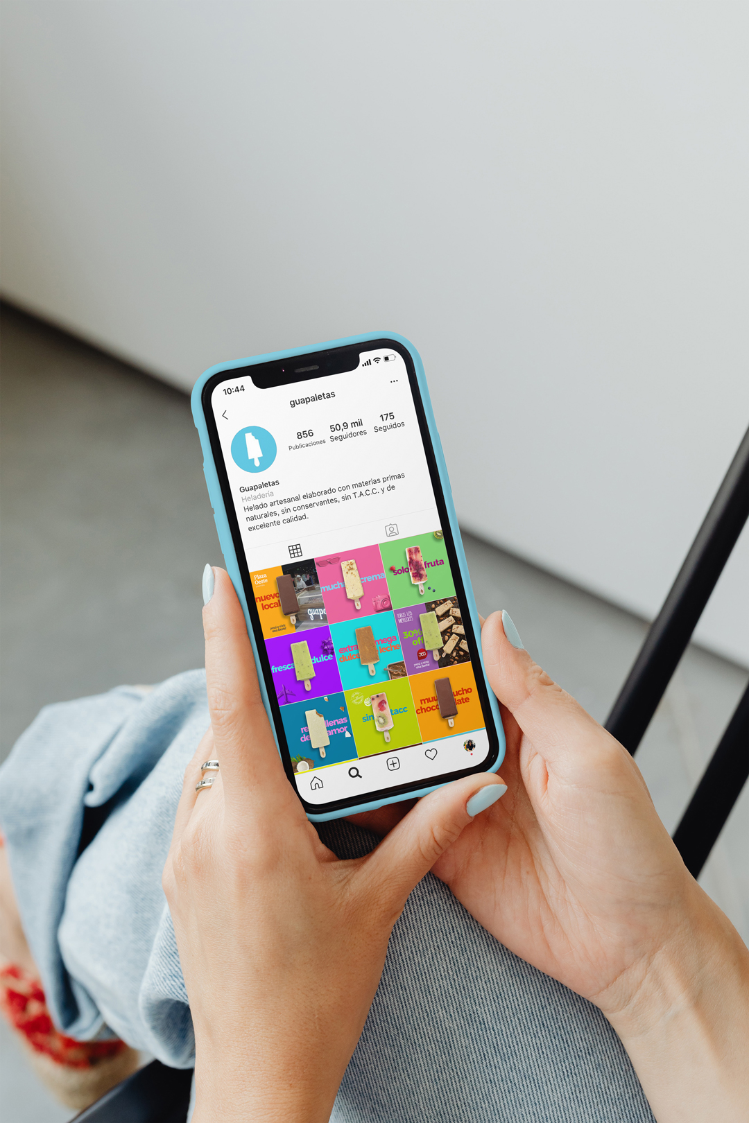
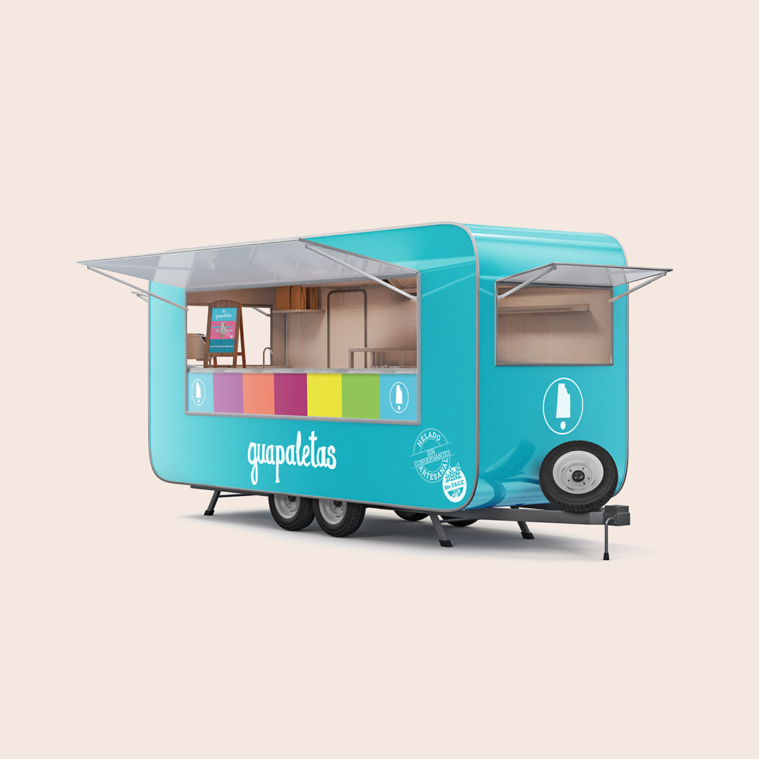
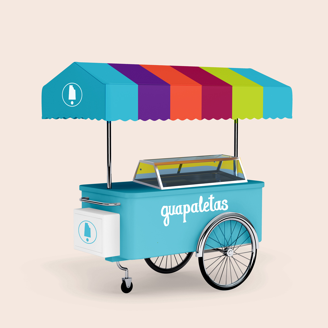
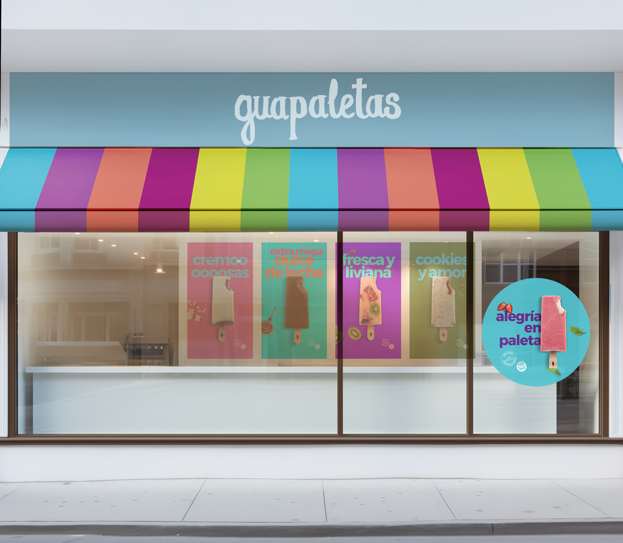
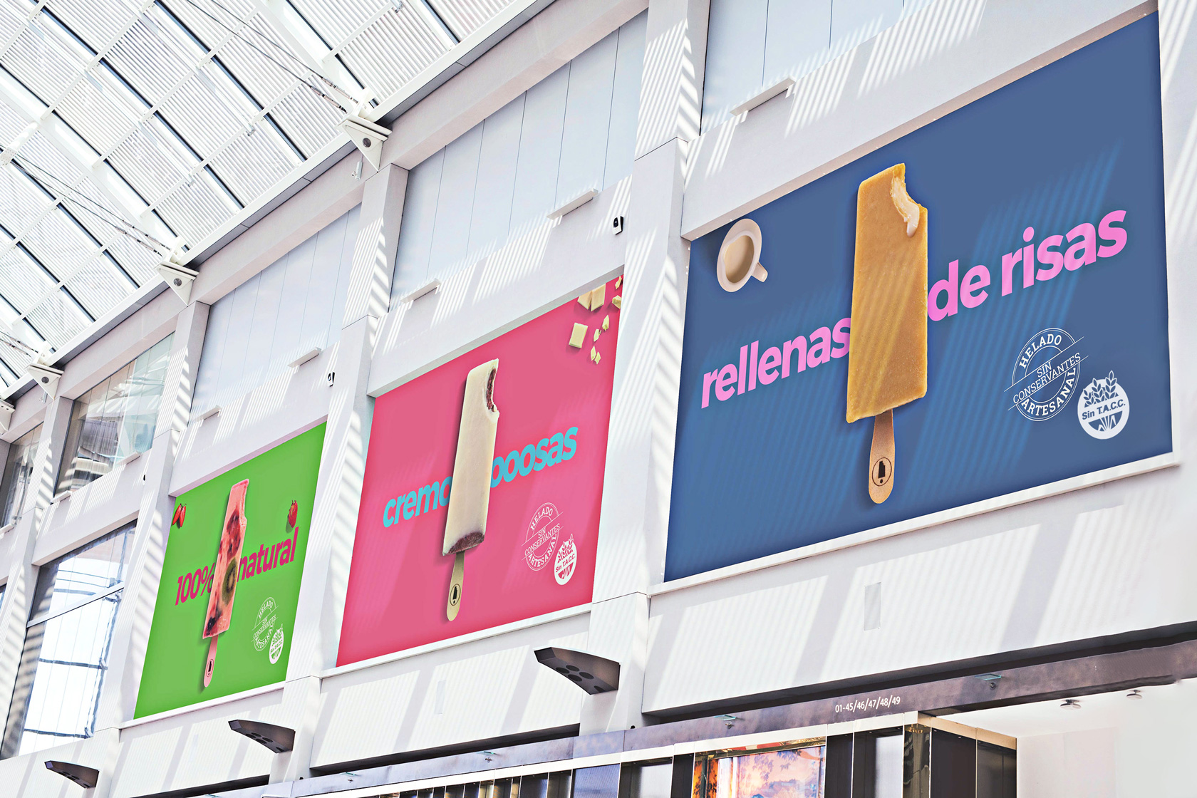
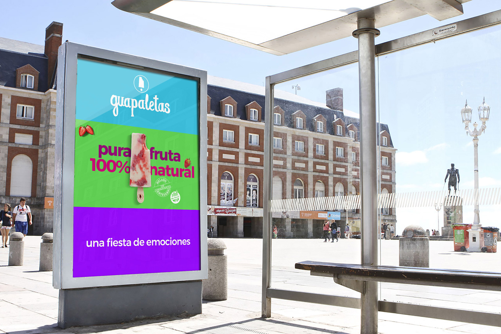
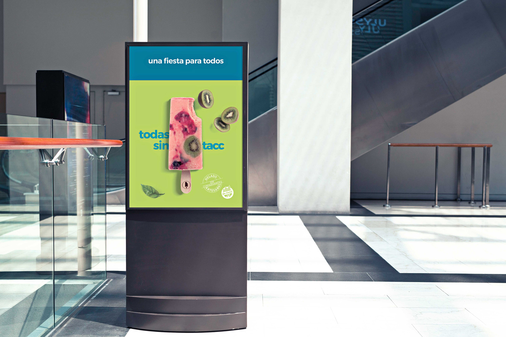
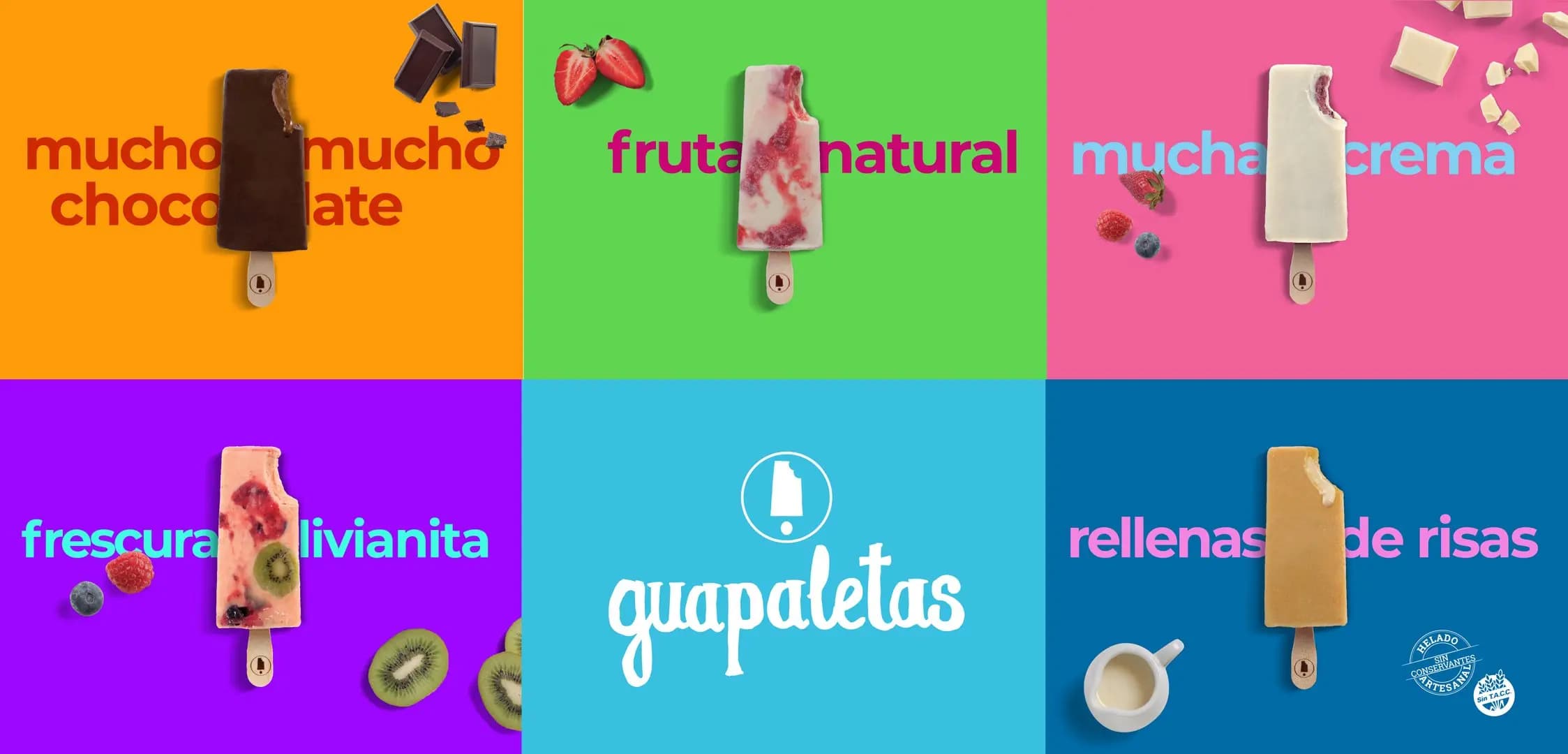
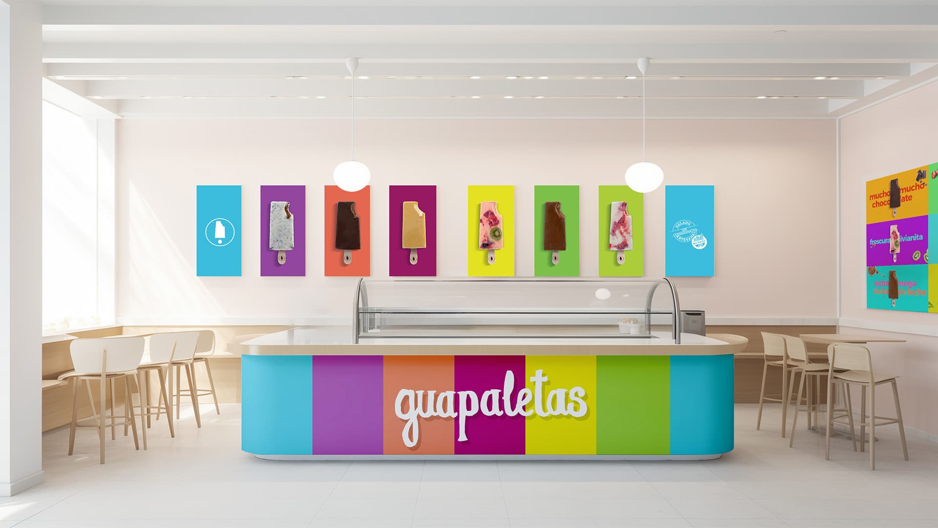
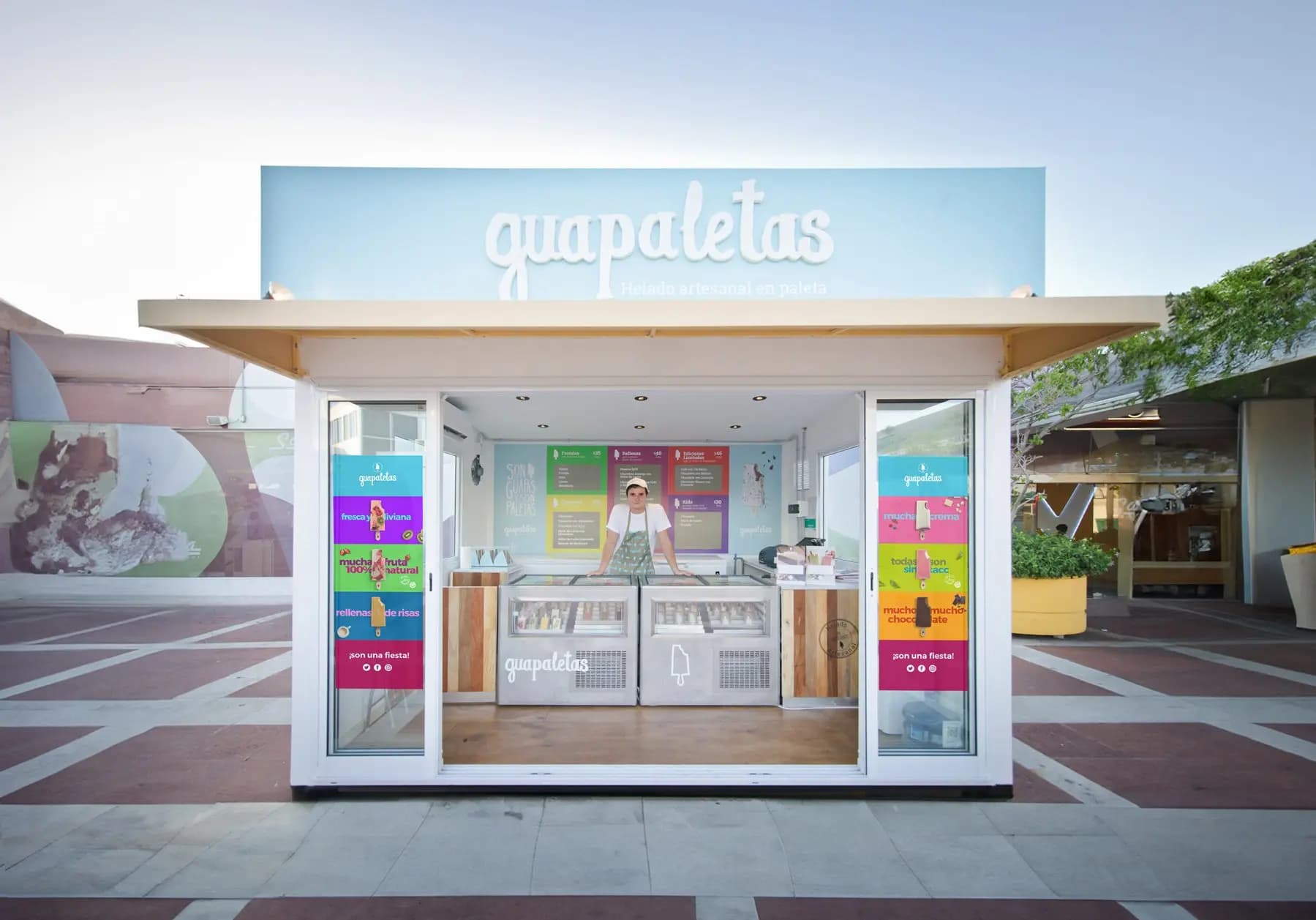
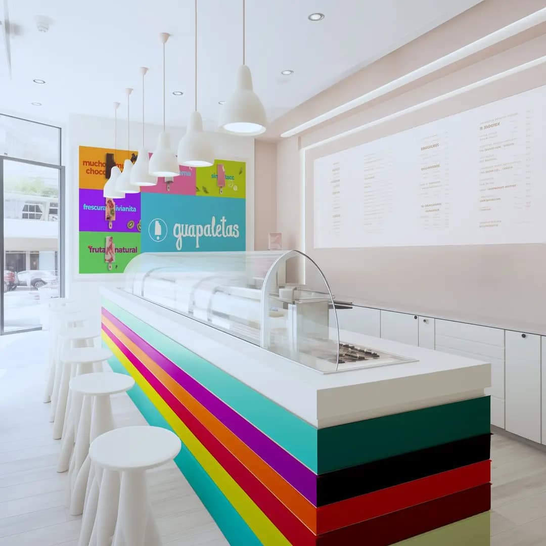
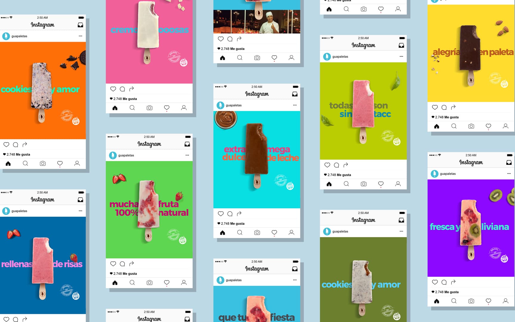
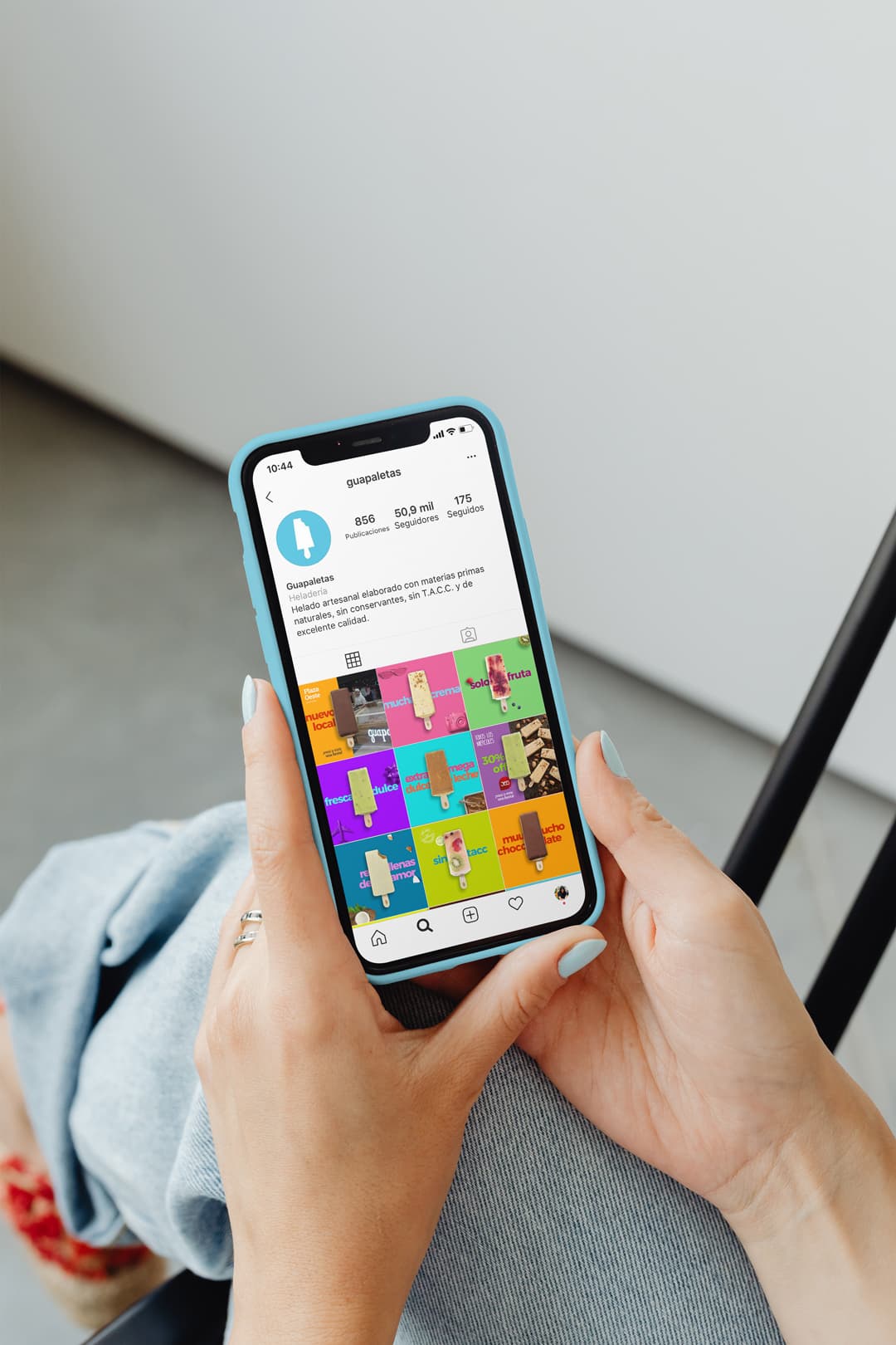
We created a bold chromatic approach. The brand palette brings an eclectic mix of primary and secondary colors that suggest the idea of a variety of flavors and ingredients. It also works as an organizing motif, with a modular design built around a simple grid of color blocks. The new identity strips out all the visual noise typical of ice cream brands. The chosen images boil the brand down to its essence: pure ingredients and fantastic flavors.
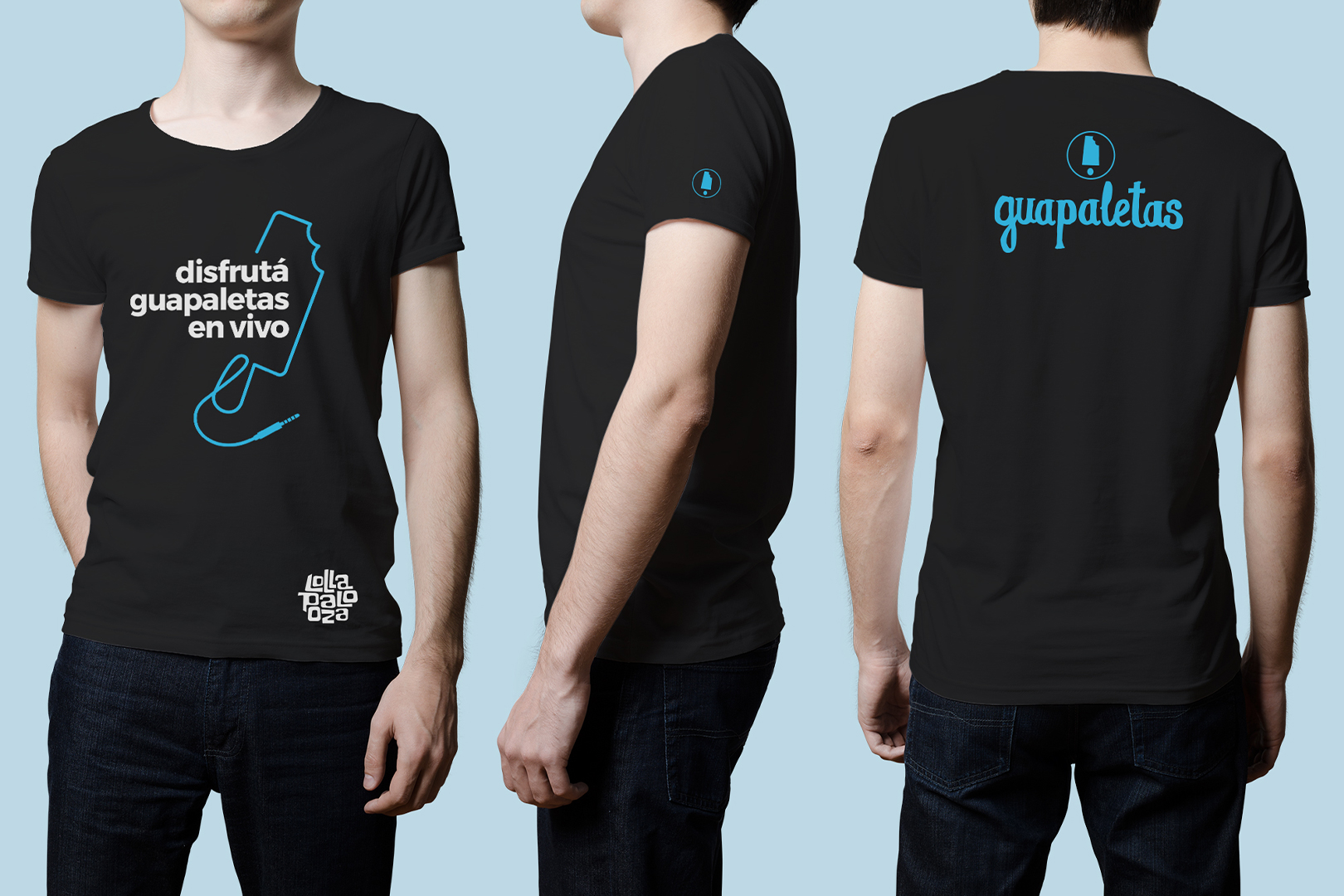
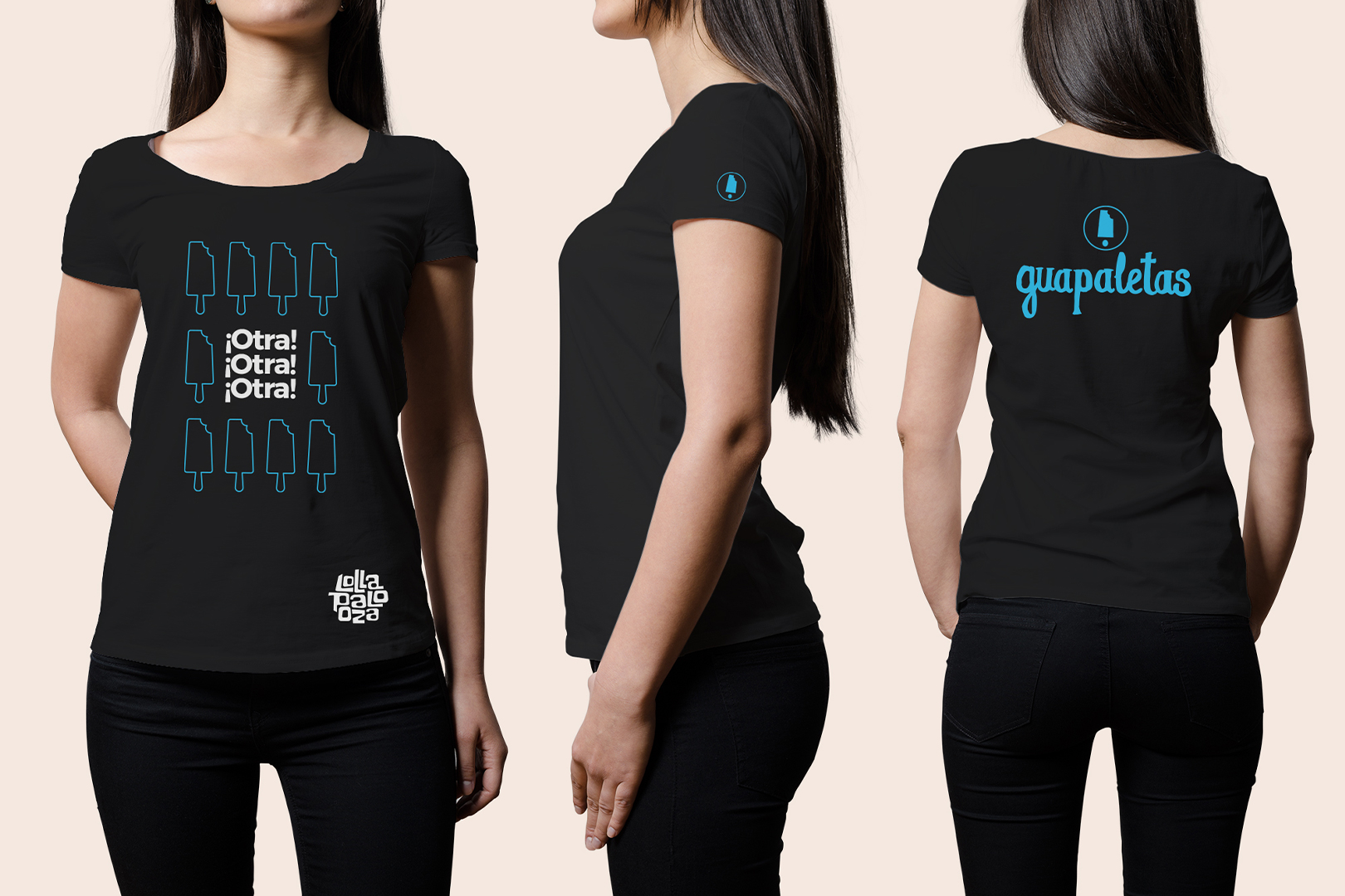
The simple sans serif typography runs through every piece, driving home a fresh, modern, upbeat message.
Gallery